The scope of work included User Experience, Interaction Design, and Interface Design.
We live in an information age where every decision is backed by data – an era where technology knows more about ourselves than we do. I’m not here to moralize, but it’s clear that we don’t have to base our decisions on blind faith anymore.
Before we spend our fortune on a new marketing campaign or launch a product feature, we can now analyze the data that will firmly guide us to make the right business decision.
Project and role overview
While still working at Welcome Pickups, I’ve got a message from a friend. He is a Technology Director at an AI-powered market research company called Pollpass – a smaller team within the larger organization of GlobalWebIndex. We chatted for a while when he pitched me about this new product he’s working on. I wasn’t interested
Fast-forward to May 2018 (and few additional rounds of pitches), my interest grew stronger and stronger. Eventually, I agreed on having a call with a team that sparked something within me. It turned out I needed a new challenge. I joined the team shortly after.
My two main goals over the last 24 months were to solve business goals as well as make the experience of our users more delightful. I worked across every stage of product development, from creating the experience of new features to prototyping and finding creative solutions to the problems at hand.
Why Pollpass?
I can’t imagine a world without messages anymore. Something that started as an experiment without a severe use case (when SMS was first introduced) has now revolutionized the way we interact with other people.
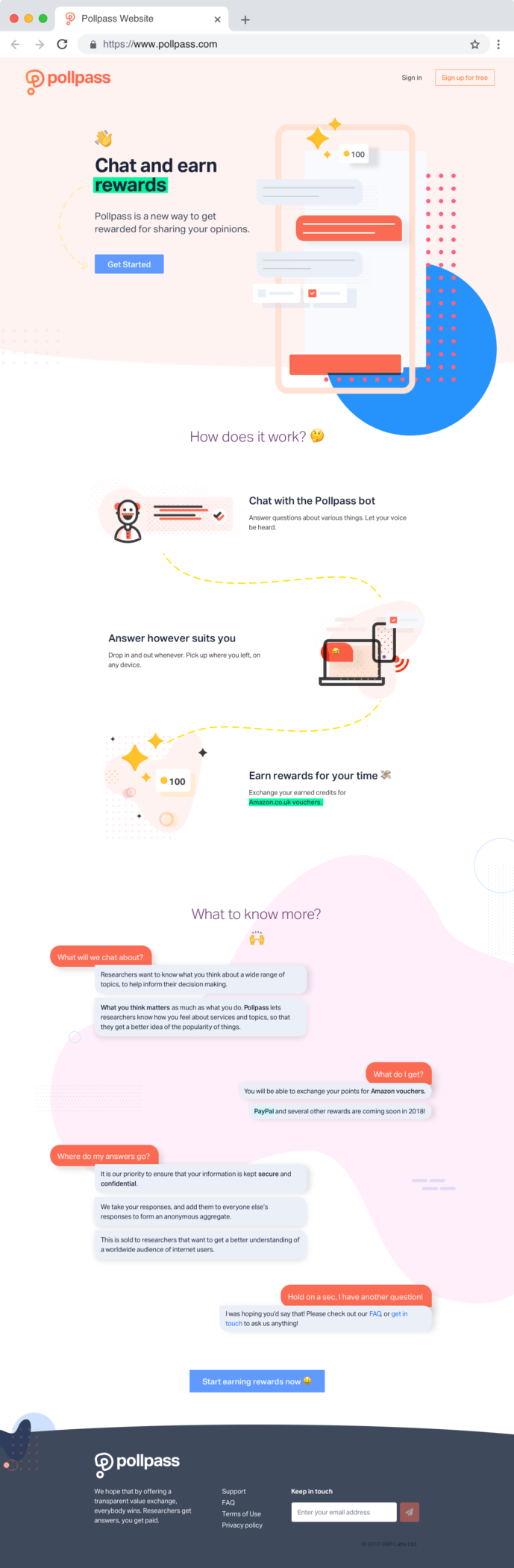
For a business to stay relevant, you need to go where people are. That’s why Pollpass was built around a frictionless, conversational interface. In other words, it is a survey experience for the modern connected consumer.
What’s excellent about Pollpass is the rapid data turnaround. While other industry-standard tools such as Qualtrics have a data turnaround of around a week, Pollpass’ can provide data in less than 48 hours.
The other advantage is the conversational interface, which was proven to decrease respondent fatigue. That means Pollpass provides higher quality data.
How does Pollpass work?
Pollpass operates in a two-sided market. On the one hand, consumers (data supply) chat with the Pollpass bot to exchange their personal data for valued incentives. By answering survey questions, they earn credits that can then be transformed into cold hard cash. On the other hand, researchers (data demand) use Pollpass Panel to access the data of large numbers of consumers.
In a nutshell, Pollpass is a value exchange between the data supply and data demand.
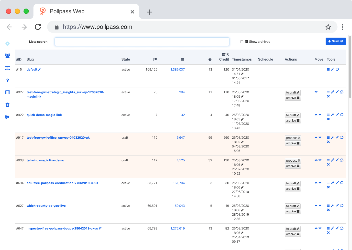
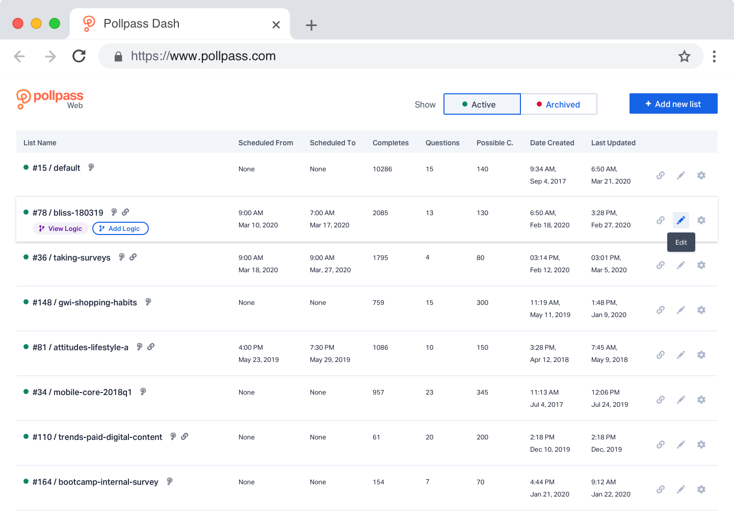
Pollpass Dash
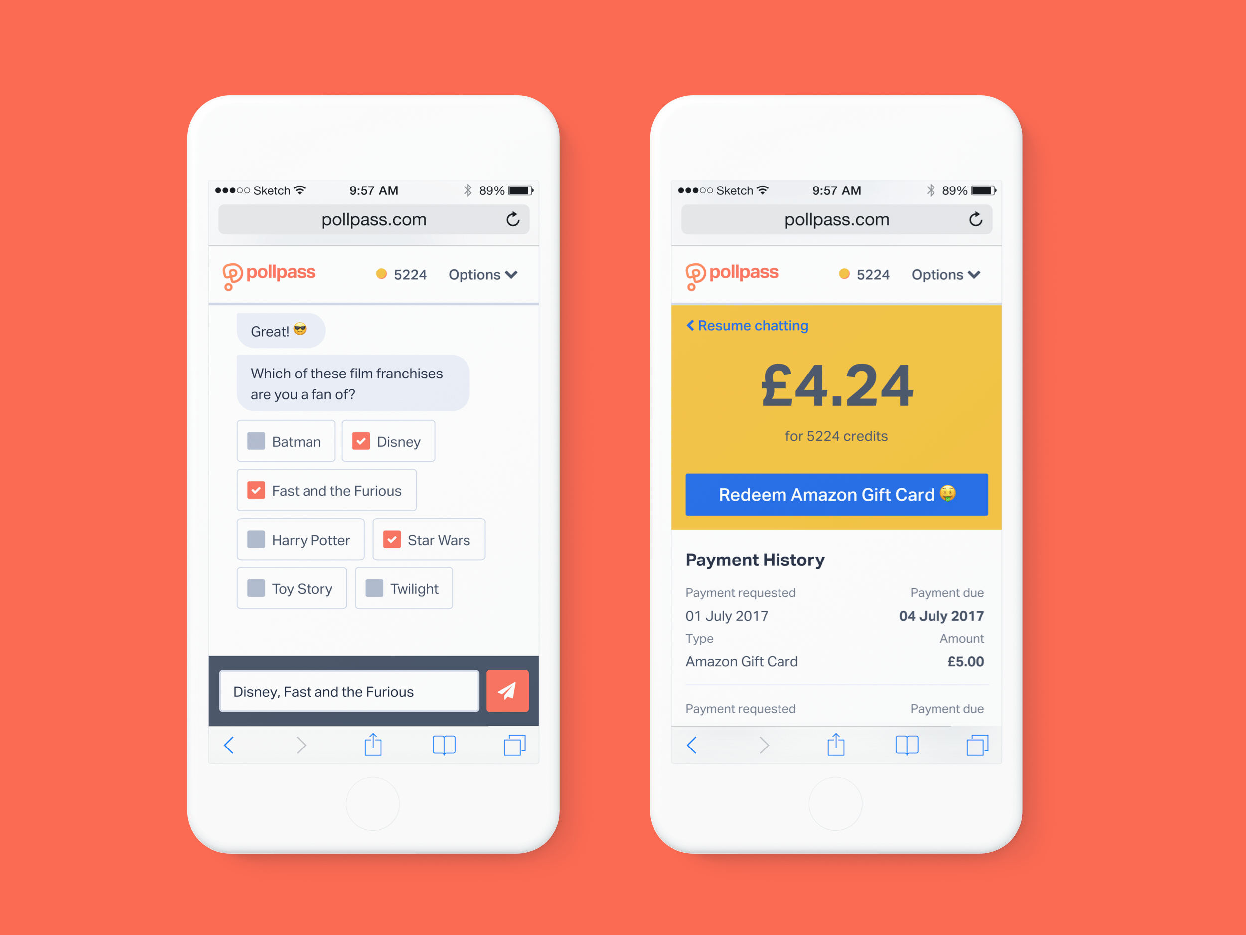
When I joined the team, Pollpass Messenger was just proven to be market fit. It was so successful, in fact, that we had to turn off registrations and rebuild our infrastructure. Another issue we faced was the increasingly complex feature requests of our clients. That called for a ground-up reconstruction of our insufficient solution for uploading surveys to our chatbot.
Equipped with factual data, current pitfalls, and client feature requests, we started writing down information architecture, which was eventually turned into wireframes. These wireframes were then passed around the team to gather feedback. Once revised and validated, visual design was applied on top of it.
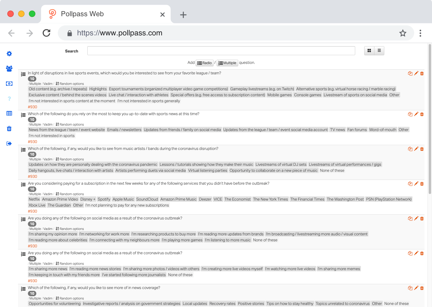

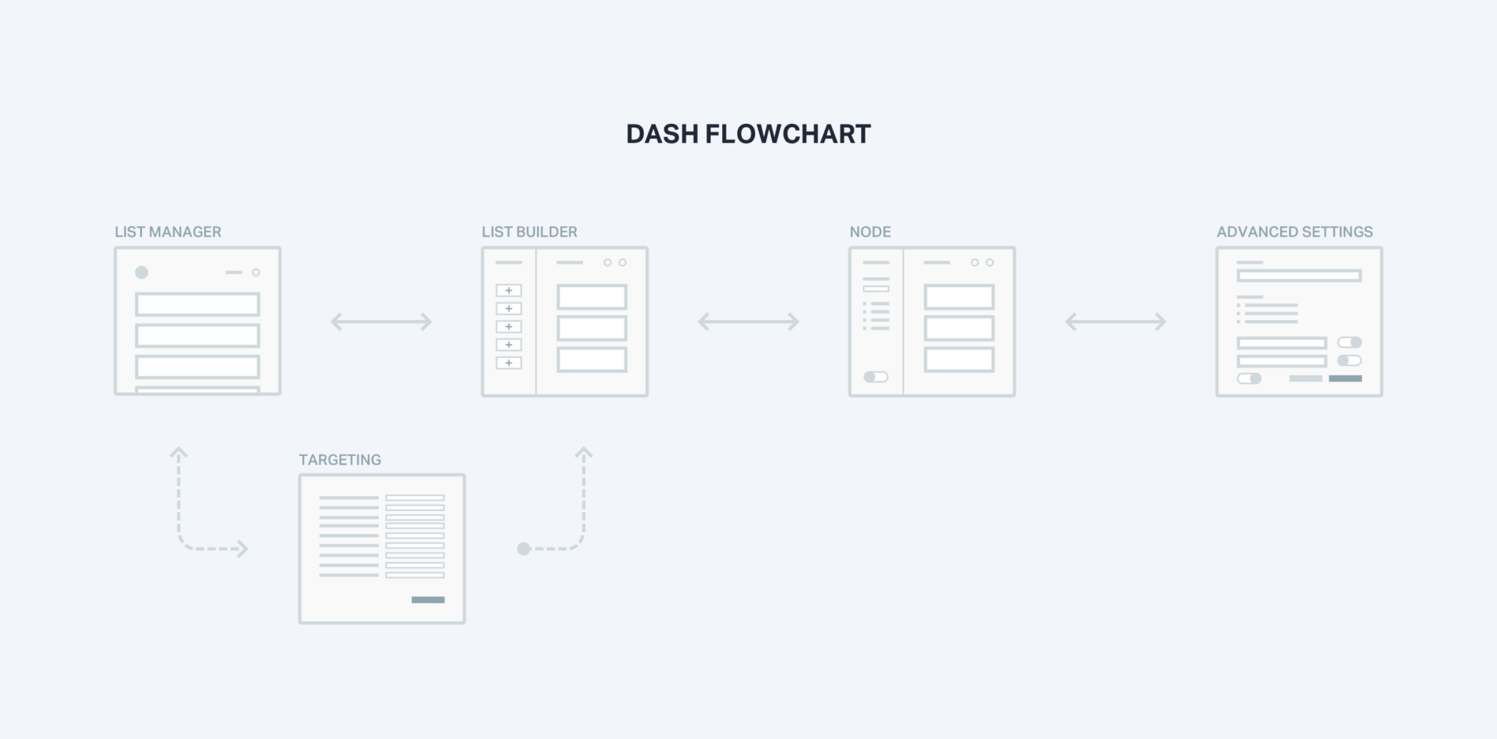
Dash 2.0
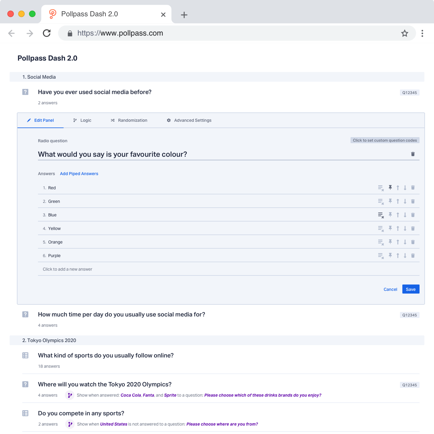
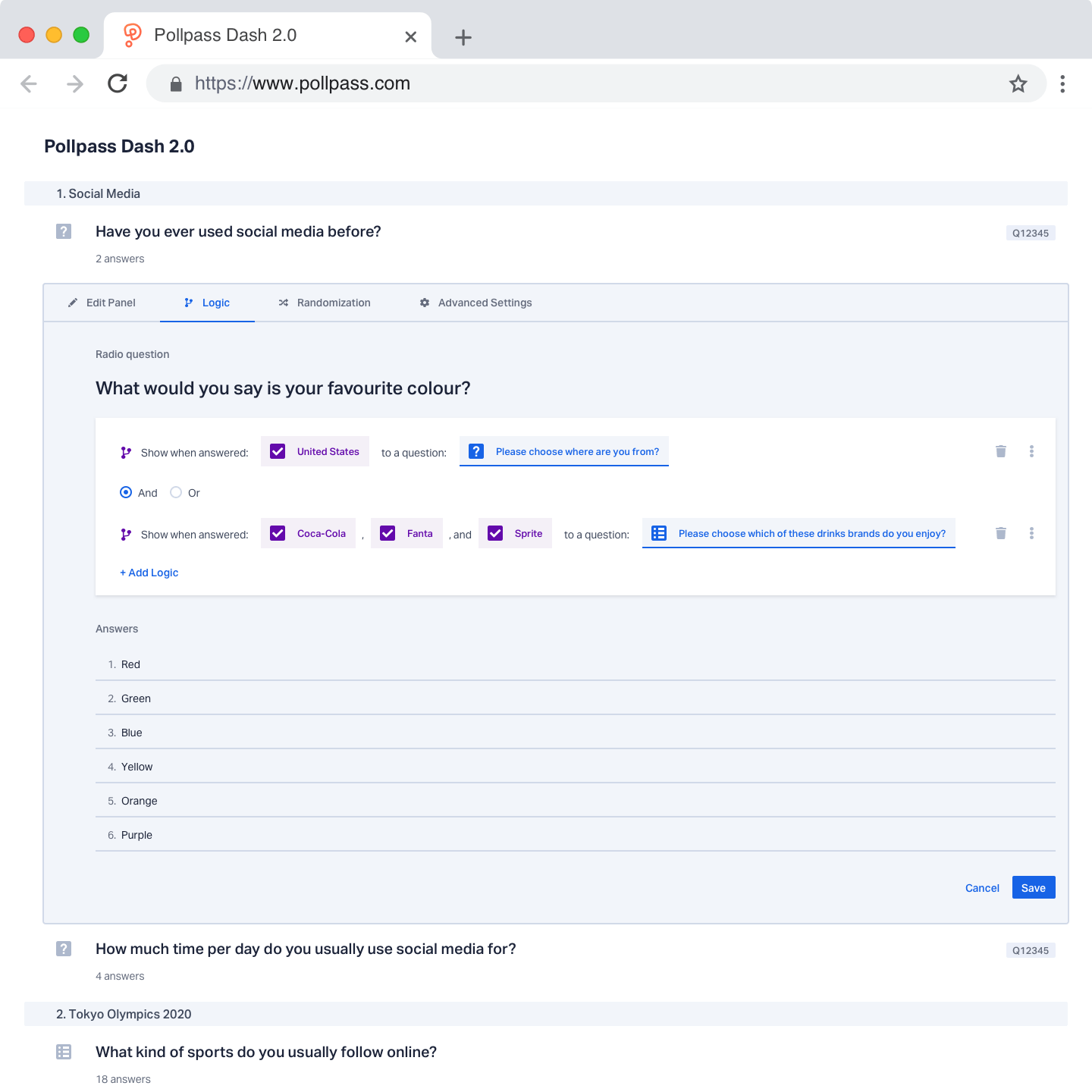
Dash supercharged our scripting workflow. It was a simple, fast, and powerful way of scripting surveys into Pollpass Messenger. However, while facilitating user tests, we identified some crucial user experience inconsistencies with Dash’s advanced functionality. In the middle of 2019, we parked some time to address those inconsistencies.
There were mostly issues with how the contextual sidebar worked and how information was displayed. In List Builder, the contextual sidebar showed information such as different node elements, questions, and answer options. Advanced settings, Logic, and Randomization were working differently. They were displayed in either a popup or a separate screen.
User tests showed that this inconsistency confused people. They were expecting a different piece of information to be displayed there or functionality to work differently.
Experimentation led us into ditching the contextual sidebar altogether. We replaced that with inline editing. That meant more consistent functionality across the product as well as not hiding crucial information into deeper levels of the product.
Interactive prototypes were built and sent to our team members that used Dash every day. Internal user testing validated that inline editing was easier to use. That being said, Dash 2.0 was never implemented because business priorities required to work on other parts of the product.
Building a design system
At the beginning of 2019, another designer joined our team. There were three of us, which meant sending a lot of design files back and forth. For the product’s consistency, it was essential to use the same styles and components.
We needed an effective system that would allow us to design rapidly and consistently. As a highly organized individual with attention to detail, this task was assigned to me.
Design system
A design system is a collection of reusable components, guided by clear standards, that can be assembled together to build any number of applications. A design system should be a living organism that evolves with the product.
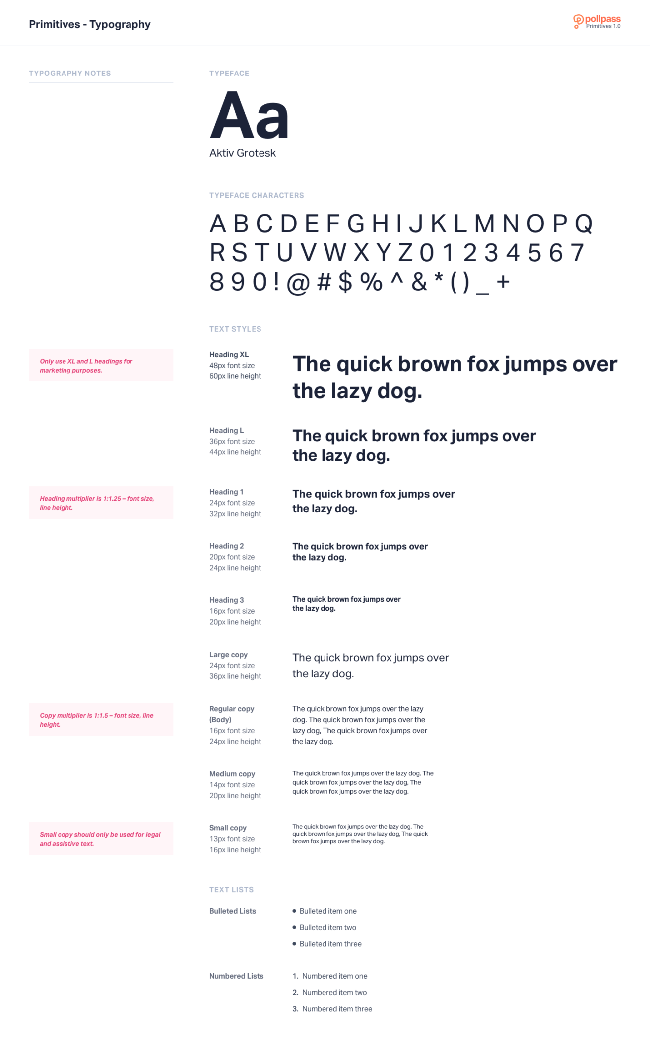
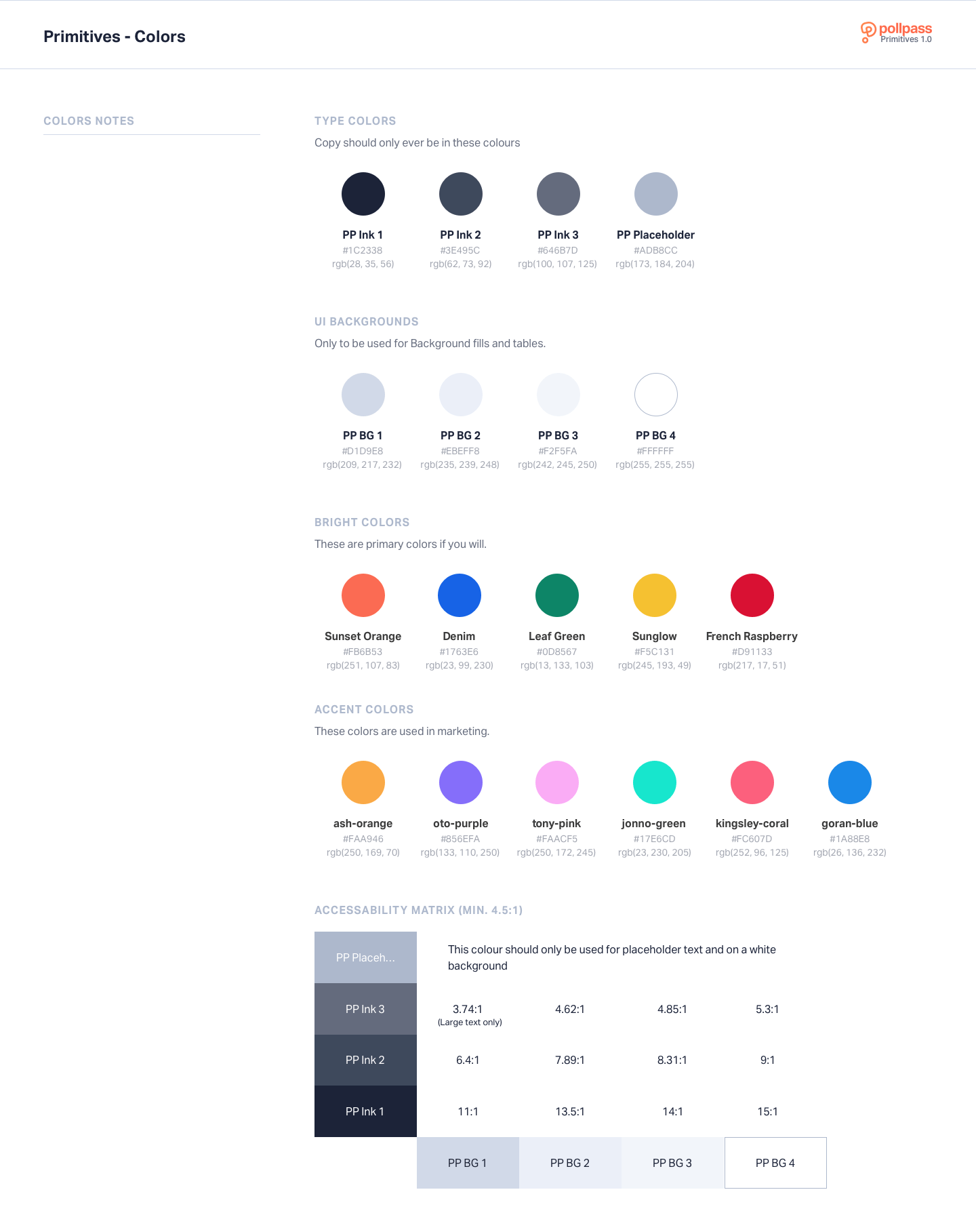
I began with an audit of our styles, components, and assets. Once completed, I re-evaluated the building blocks of our design system. I called these Primitives, and it consisted of Typography, Colors, Spacing, and Depth.
By using Atomic Design methodology, Primitives were atoms – the most basic components of our design system from which everything was built upon.
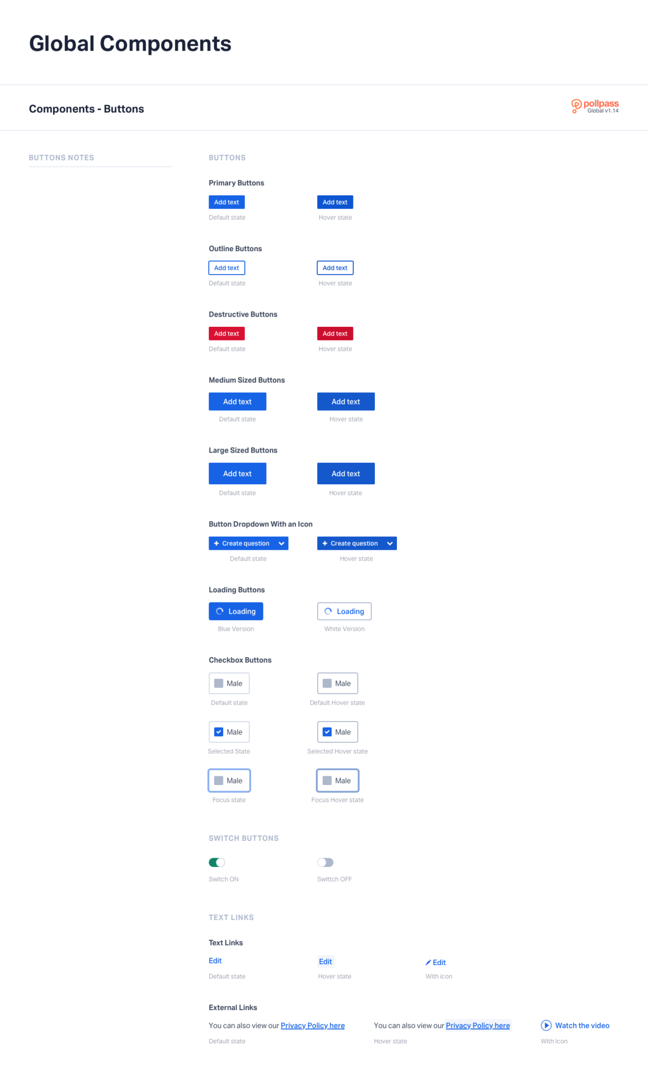
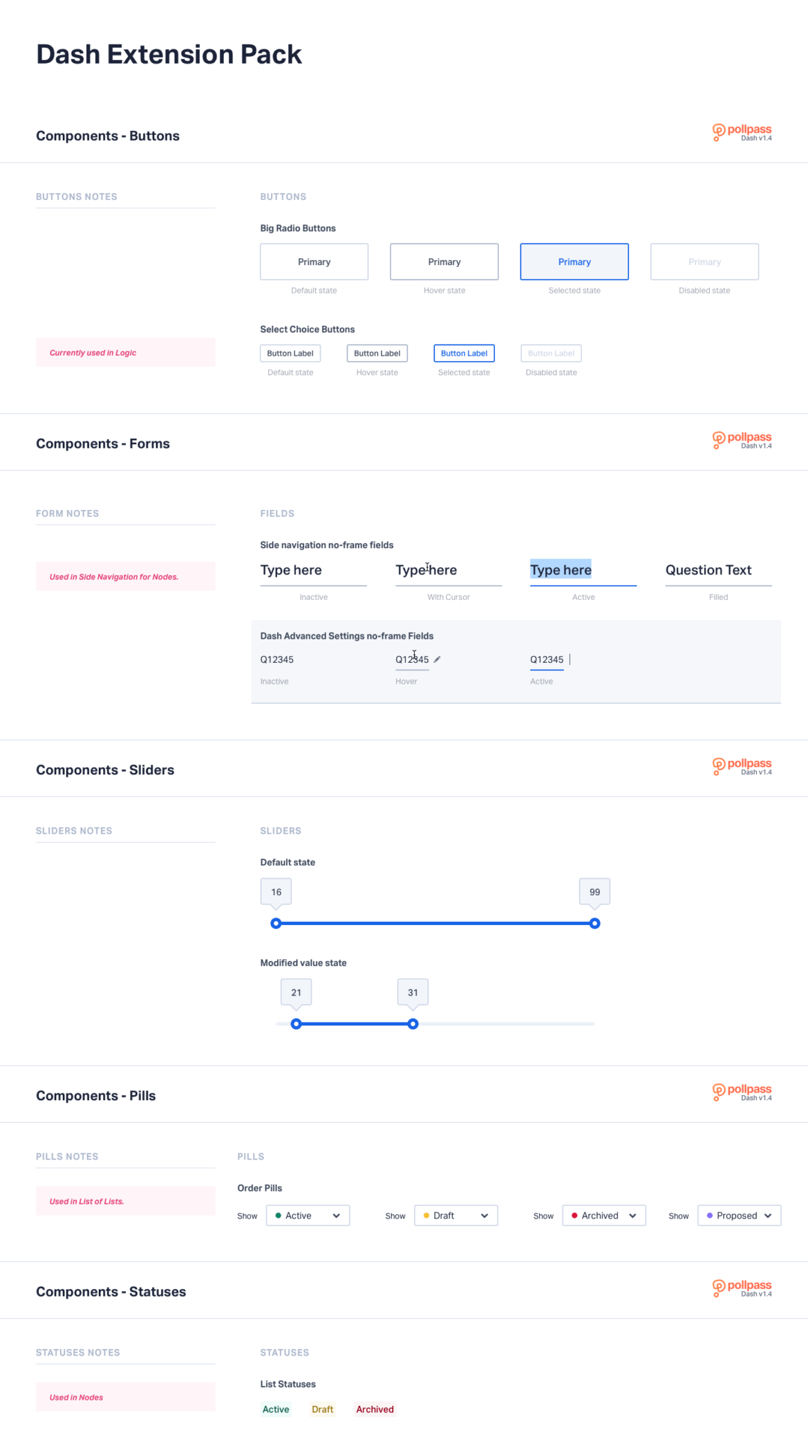
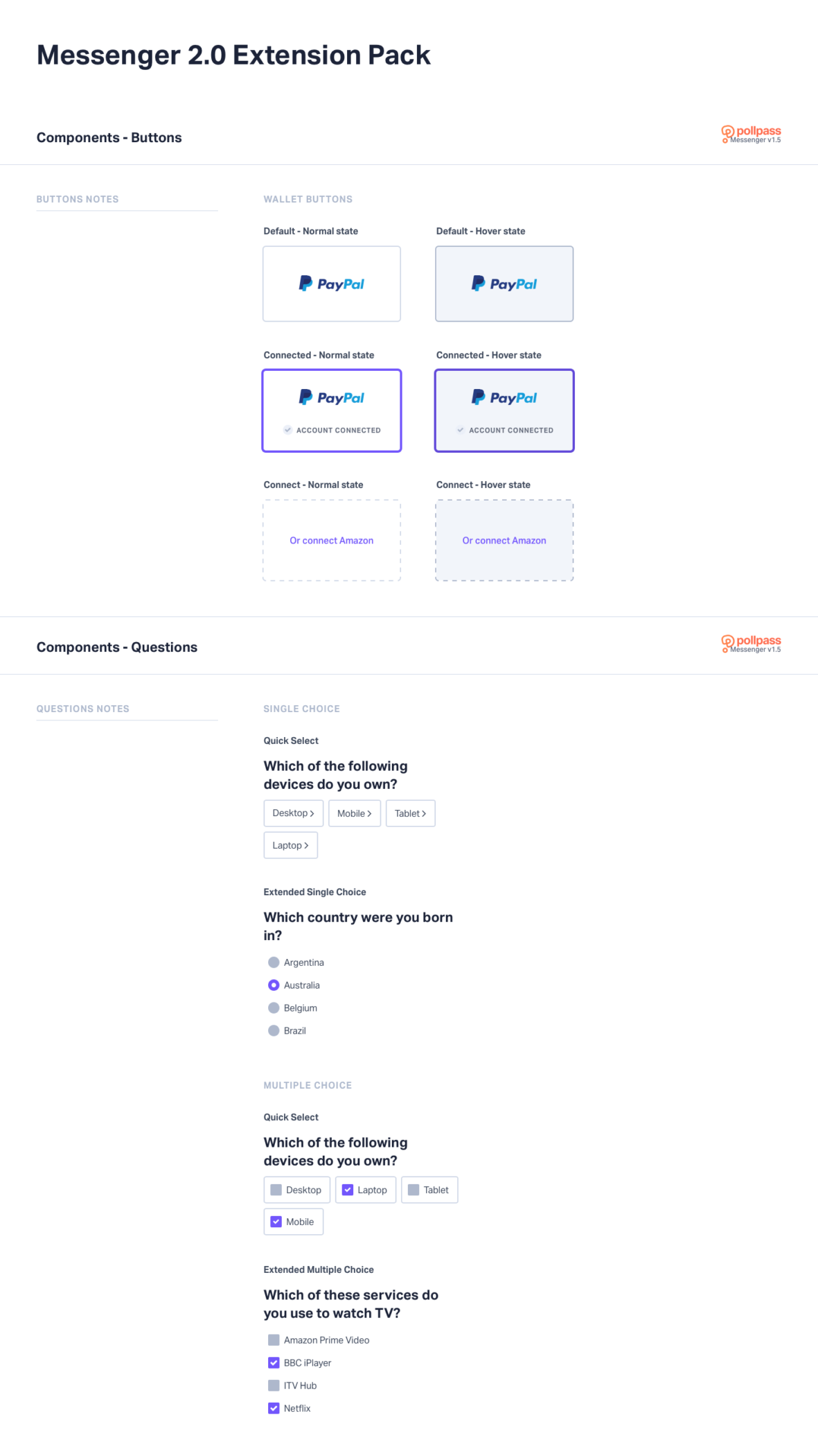
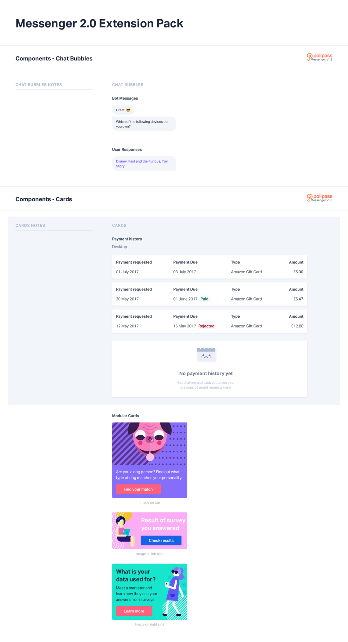
Once Primitives were defined, I divided components into Global UI Kit and two UI Kit Extension Packs – Dash and Messenger extension pack. While Global Components were building blocks that were used across products (such as buttons, forms, and modals), Extension Packs contained product-specific components that were only used in a specific product.
Flexible color system
Creating a color palette was one of the earliest building blocks we thought about when creating the design system since it’s so fundamental to design and development decisions. The more we developed the design system, the more we thought about if we could create a system for a flexible color palette.
Why create a flexible color system?
- It’s Accessible. To be sure everyone has a great experience, we support Level AA color contrast or a 4.5:1 contrast ratio.
- Prevents inconsistency. Ramps provide a consistent look and feel across products.
- Eliminates guesswork. The color system should provide a direction and instill confidence in the designers that they are making the correct color choices.
- Supports future growth. The color palette should have a systematic pattern which can be added to as the needs of the design system grows.
- Brings brand harmony. Each color theme should have the same value steps in tone. The essence of our brand is the relationship between highly saturated color values and brilliant hues.
- No breaking changes. Going forward, we wanted our color system to work in any situation.
We first looked at different color models and how color perception affects light, shade, and RGB color space. The purpose of the research was not to copy and paste their ideas, but rather to look under the hood and understand the underlying decisions behind their color selections and look for patterns we could learn from.
Then we analyzed other themed color palettes that use ramps by investigating palettes from IBM Design, Material Design, Open-Color, and Trello. We hoped we could find a solution that would allow us to set the Hue and find a predetermined color ramp that was always accessible and on-brand.
After many weeks of experimentations, we came up with a Pollpass Color Curve that ensured new color additions are always accessible and more likely to be on-brand.
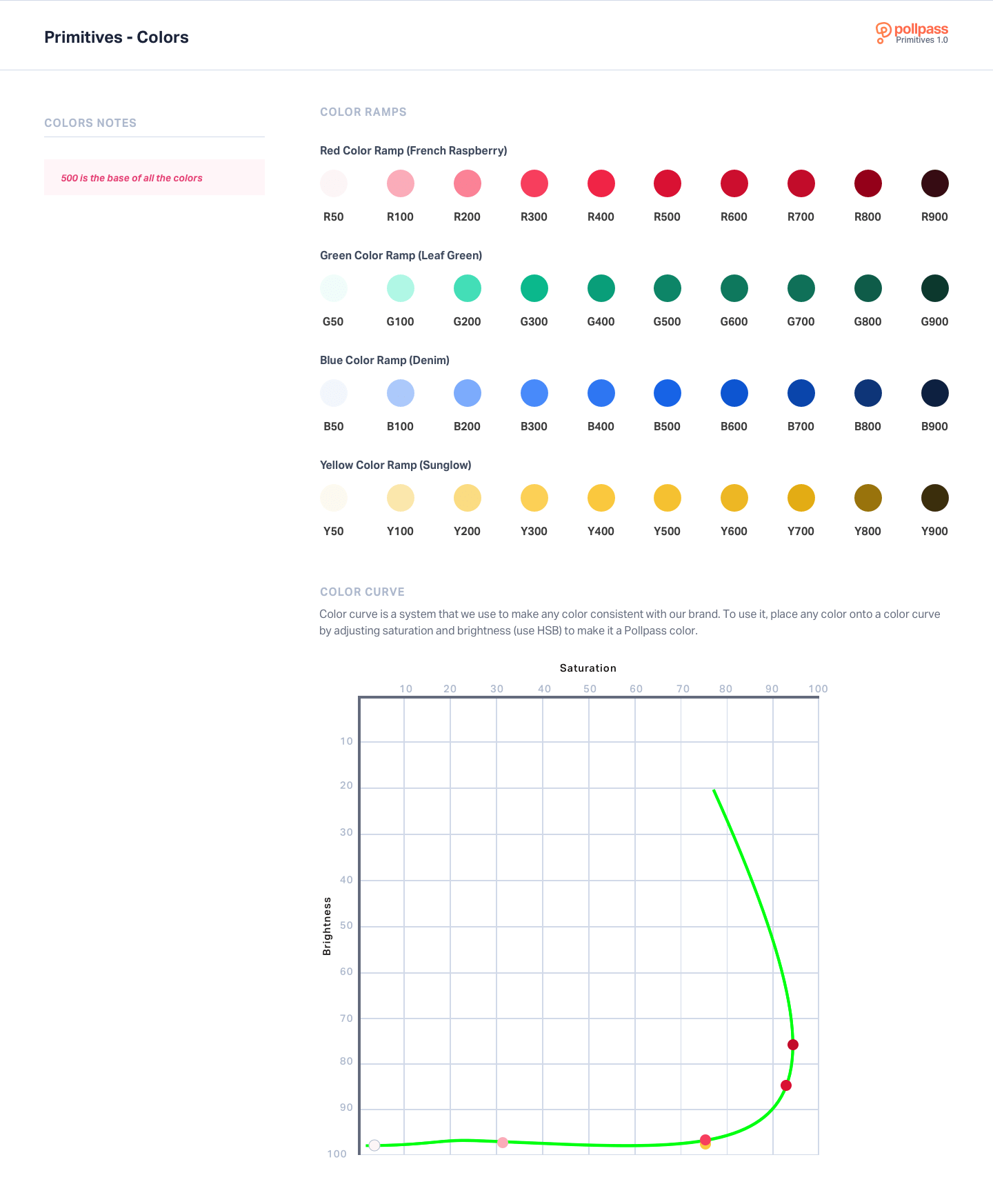
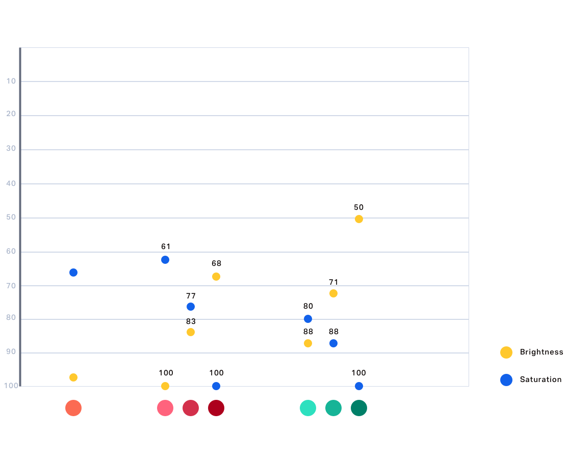
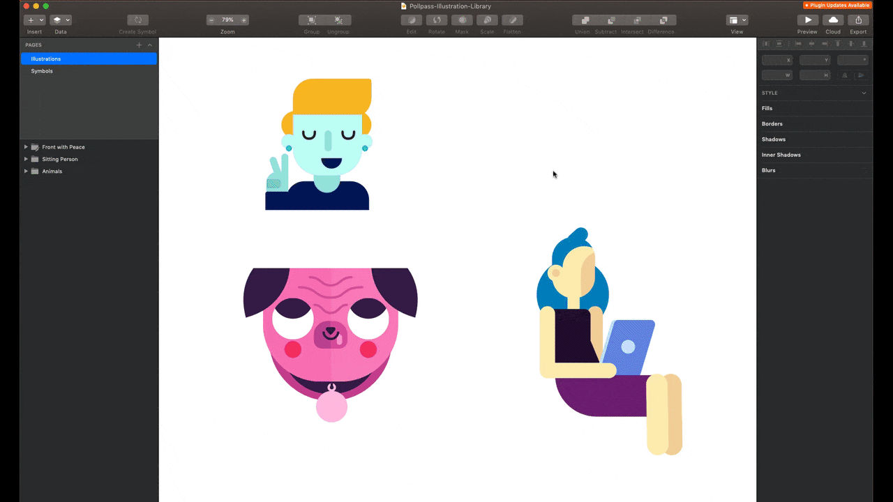
Illustration Library
Pollpass is a fun brand, and illustrations are an essential part of it. That’s why we spent some time building an illustration library. It enabled us to iterate and produce elaborate illustrations rapidly.
Product Masters
I have briefly mentioned the disadvantages that come when multiple designers work on the same project earlier. Without a proper system in place, it can become messy quickly. With everything I have mentioned above, we were ready for the last but important step – a system that allowed us to be on top production.
We build Product Master files that include all the flows and screens in a particular product (Dash, Messenger). It was a Sketch-editable representation of screens that were in Zeplin. These files were only updated once a new flow, screen, or iteration was confirmed and communicated with the developers.
That way, we always knew what is in production and what is being built without assuming what the latest design version is.
Pollpass brand realignment
When Pollpass first started, Tony and the rest of the team chose values they wanted to embody. These values were Transparency, Honesty, and Moments of delight. However, these values were determined before Pollpass was launched to the market and had any users. We felt the need to re-interrogate these values to see if they were still relevant and useful.
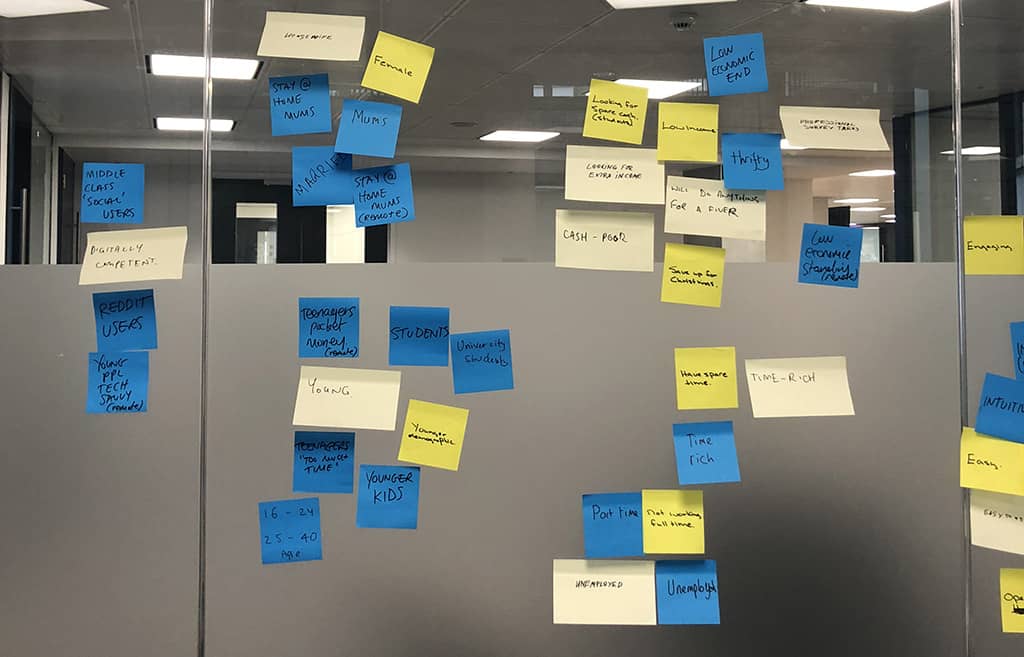
In a series of workshops, we tried to define who our audience is, what our unique selling points might be, and how we appear as a brand. This work was intended to uncover the essence of Pollpass as a brand.
As part of the exploration work, we created surveys to be completed by the team internally and to be completed by our users. We chose users who had completed over 500 questions on Pollpass from a mix of organic and affiliate traffic. We asked brand sentiment and brand positioning questions.
This redefining of values made us realize that Transparent and Honest were one anyway, so we combined it into one. Rewarding now replaced Moments of Delight value. Moments of Delight did a great job of providing value where the user least expected it. Still, we needed a value that really captured the brand’s desire to be a more rewarding and valuable experience.
In our previous brand values, we felt we had a solid direction in terms of voice and appearance. We knew we wanted to be honest and delightful, but we didn’t have values that represented our agility, our desire to provide industry-leading data, or our ambitions in general. That is why we have included Superior Experience as a new brand value.
Our new brand values were now Transparent, Rewarding, and Superior Experience that guided our every decision from that point on.
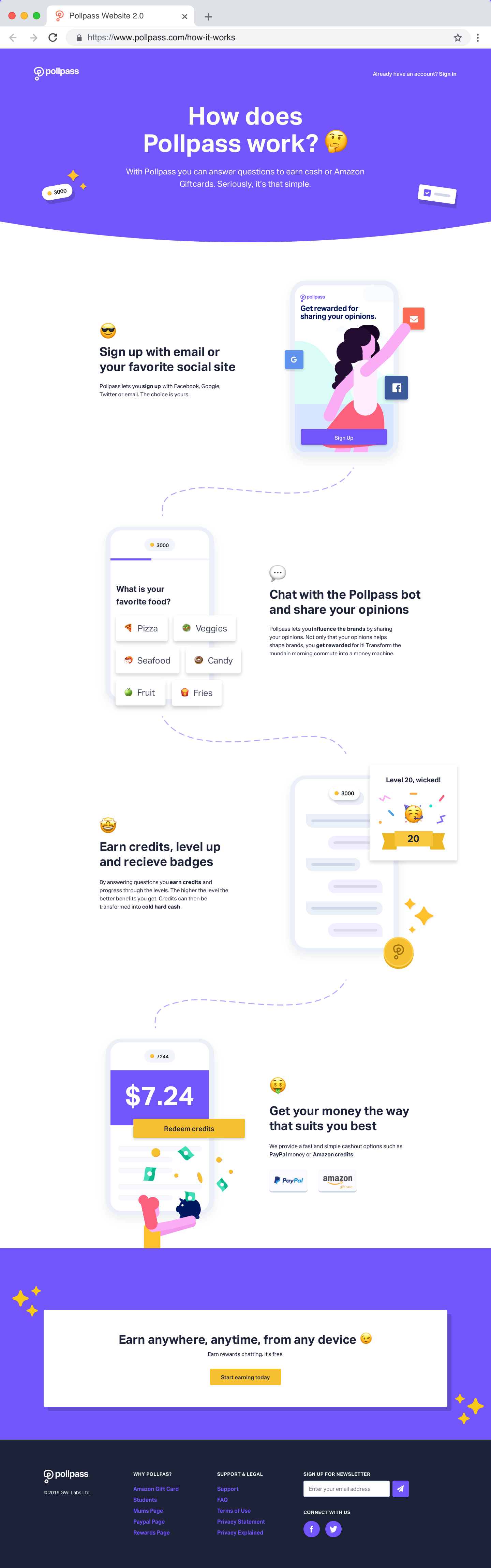
New brand values kicked off a series of events that followed. First, we changed our primary color since the orange we used until that point wasn’t accessible and didn’t reflect Transparent brand value.

That led us to Pollpass Messenger 2.0. We took this opportunity to address and revise the current issues with the chatbot so the product would reflect Superior Experience.
New brand values also meant we had to redesign the web page.
Growing Pollpass
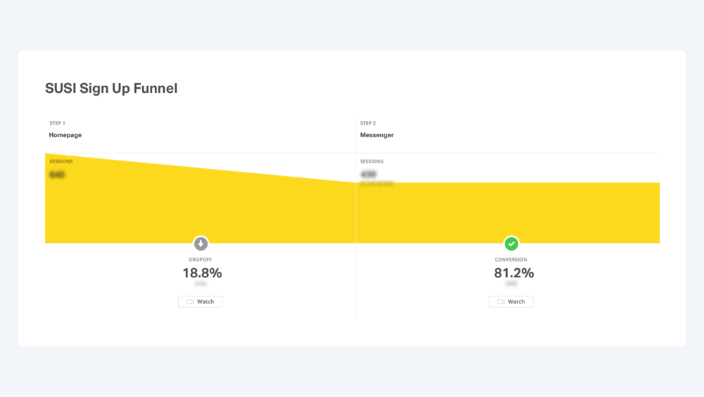
After the brand realignment, our primary focus was on user acquisition and user retention. We ran tests every week that were designed to optimize user growth.
A turnaround of a single test was three sprints. We spent a week building the test, a week running it, and a week analyzing the data. This meant there was a new set of learnings coming in weekly. We used those learnings to optimize. At one point, our sign up form was converting at over 80%.
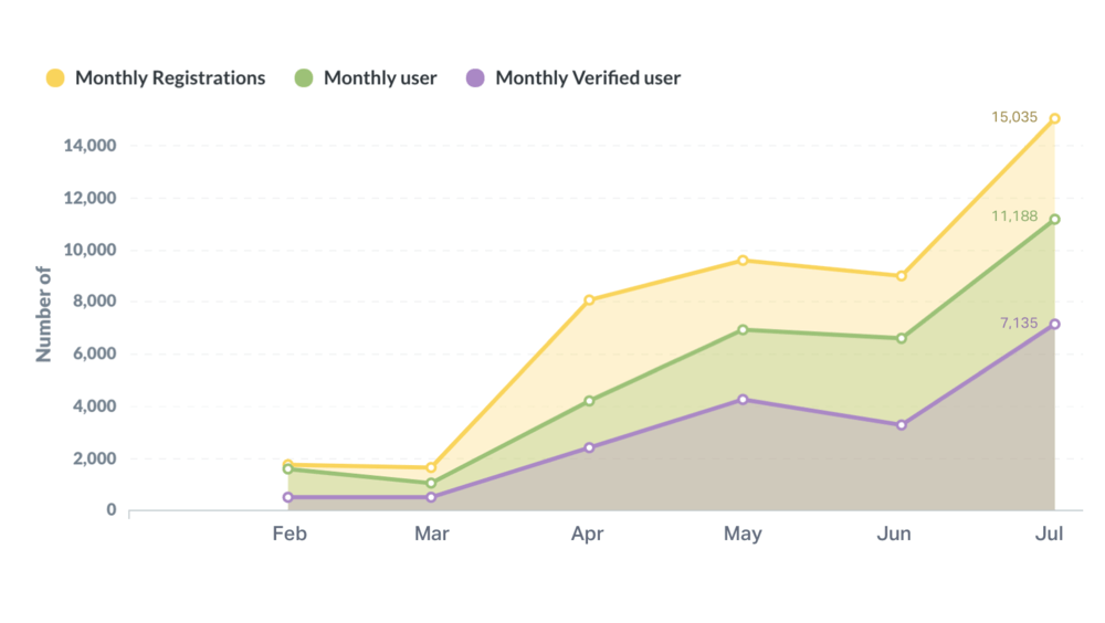
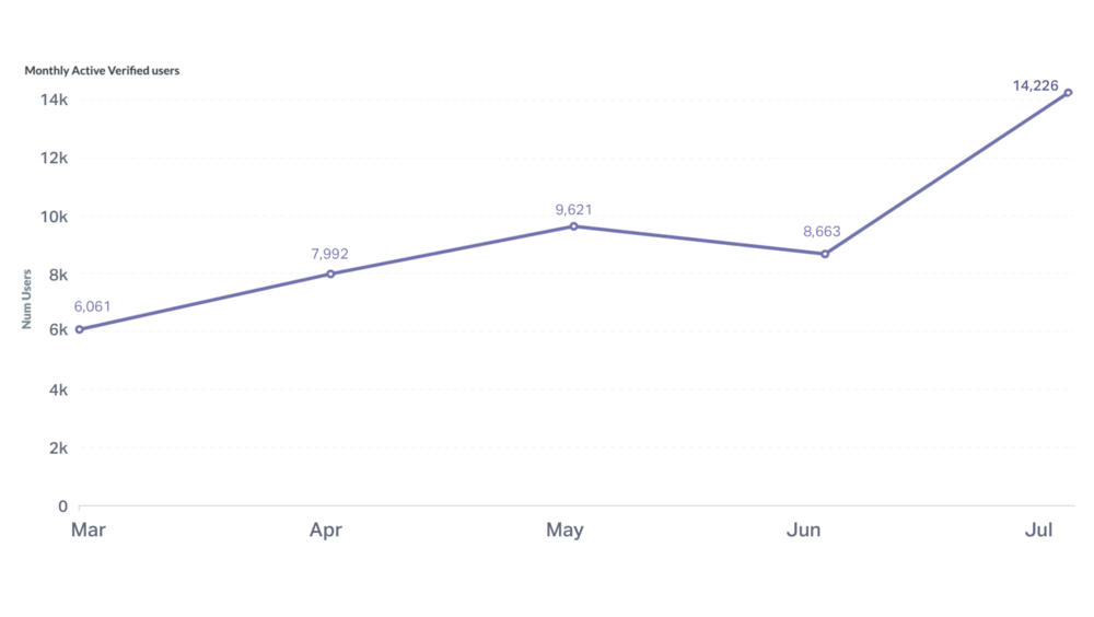
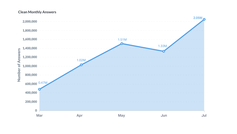
Just before I left the company, we had over 250,000 users and had collected over 65 million answers for our clients.
Do you like what you see and have a project in mind? Let’s talk!