You are about to read a combined case study of the three apps I did for Easy Tiger Apps. The scope of work included Strategy, User Experience, Interaction Design, and Interface Design.
When Apple introduced iOS 7 in late 2013, they have caused a lot of tension among interface designers. I still remember skeuomorphic versus flat design wars that went on for months and even years that followed.
Project and role overview
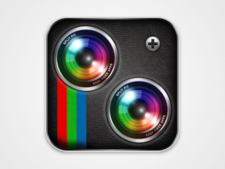
In early 2014 I was approached by Easy Tiger Apps, a New York-based company that focused on photo and video mobile products to redesign an iOS icon of one of their products called Split Pic.
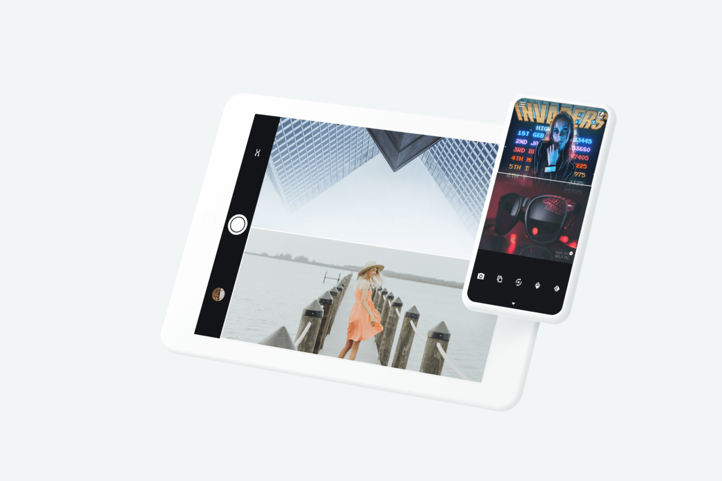
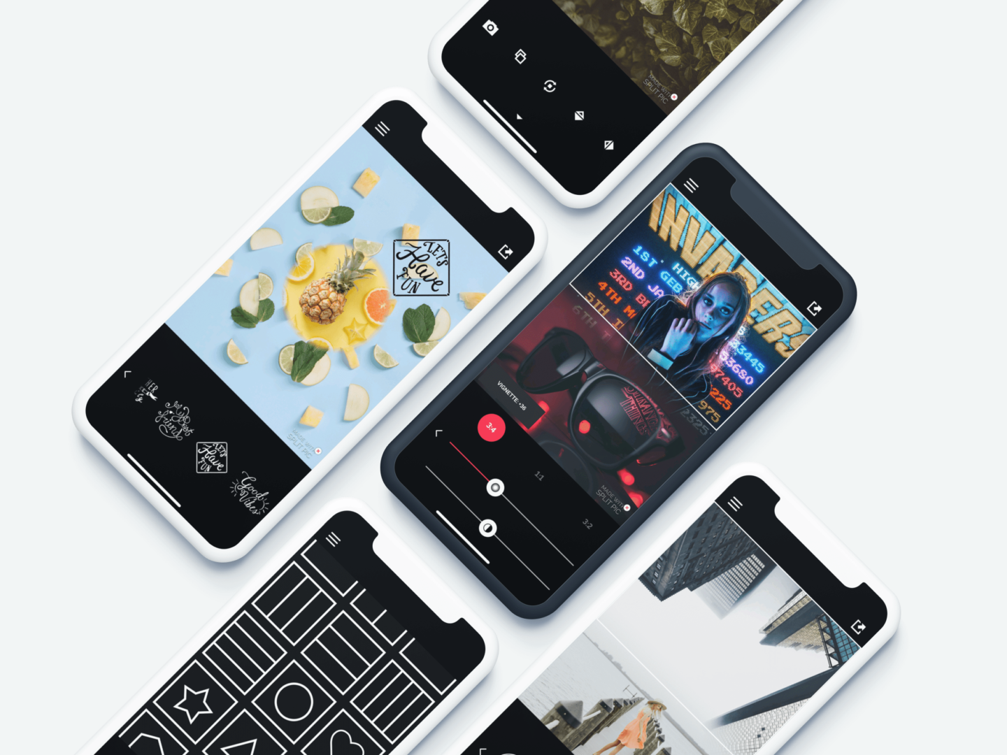
Split Pic divides camera into multiple sections. There are a variety of different layouts for people to choose from, which they can then blend to create unique and stunning images.
The process
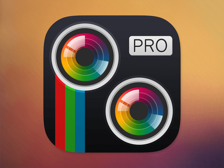
My goal was simple – to flatten the current iOS icon to include the new design guidelines of the newly rolled out iOS 7.
Soon after I have delivered the new iOS icon, they reached out again if I could help them redesign the entire product. A lot of products were doing visual updates in the iOS 7 aftermath, but sadly so many of them were doing just that – a visual upgrade. It was an opportunity to address current fallbacks and improve user experience, but this was more an exception than the rule.
Repackaging a candy that tastes awfully won’t solve the problem, will there?
It was a pleasant surprise when I learned they don’t just want the visual update but re-building the project from scratch. All the data they have collected from their user base up to that point, and App Store reviews were helpful for me to identify where the most significant issues were.
I started a project by first facilitating a remote workshop with a client where we defined problems that we were solving for our users, our target audience by sketching out user personas and analyzing the data they have collected. This was my north star which guided every design decision I made until the completion of the project.
By writing down the information architecture of the previous version of the product I have reviewed the content and the context in which the content is presented to the target user. That helped me to identify where the context is confusing, what information is missing and what could be removed.
When I was analyzing the old information architecture and coming up with a new one I asked myself various questions such as:
Content-based
- What type of information are we dealing with?
- What relevance does it have to the user?
Context-based
- When is the user seeking out this content?
- When, why, and how is the user engaging with this content?
User-based
- Who is consuming this content?
- What does it mean to them? What value does it provide?
- What pre-existing expectations do they have?
By answering these questions, I was better equipped to come up with a solution where the right information was provided at the right moment in the right way. Assumptions were later validated with in-person user testing. A prototype was built in InVision and shared on a mobile device to the participants.
What would I do differently today
The turnaround for this project was rapid. That’s why I decided to skip the wireframing part of the process. I’ve sketched out basic layout structure in my sketchbook, but I didn’t validate those wireframe layouts beforehand starting to push pixels around.
What happened later was that when I conducted a simple user testing session with my friends and family, I quickly realized some parts of the app needed more thought to go into it.
If I had validated wireframes before jumping into user interface design, I would have figured out some issues much sooner. This caused me to spend more time on revisions at a visual design stage, which was more resource-heavy than it could have been in the low-fidelity wireframe stage.
Results
When a product gets redesigned, it can generate two opposite poles. First, there are users who are happy with the update, and then there are the ones that don’t like it. Luckily for us, our target audience absolutely loved the new look and feel.
This didn’t go unnoticed – Apple featured Split Pic on App Store. Before an update, Split Pic had around 10 million users. This number has now risen to a staggering 50 million users, and it’s still growing every single day.
What has followed?
After the update, Split Pic 2.0 quickly rose to the top 3 apps in the Photo & Video category on the App Store and stayed there for a long time. The company and I agreed that I would help them turn two other app ideas they had into life. Both of them were then featured by Apple on the App Store as the best new apps in the Photo & Video category.
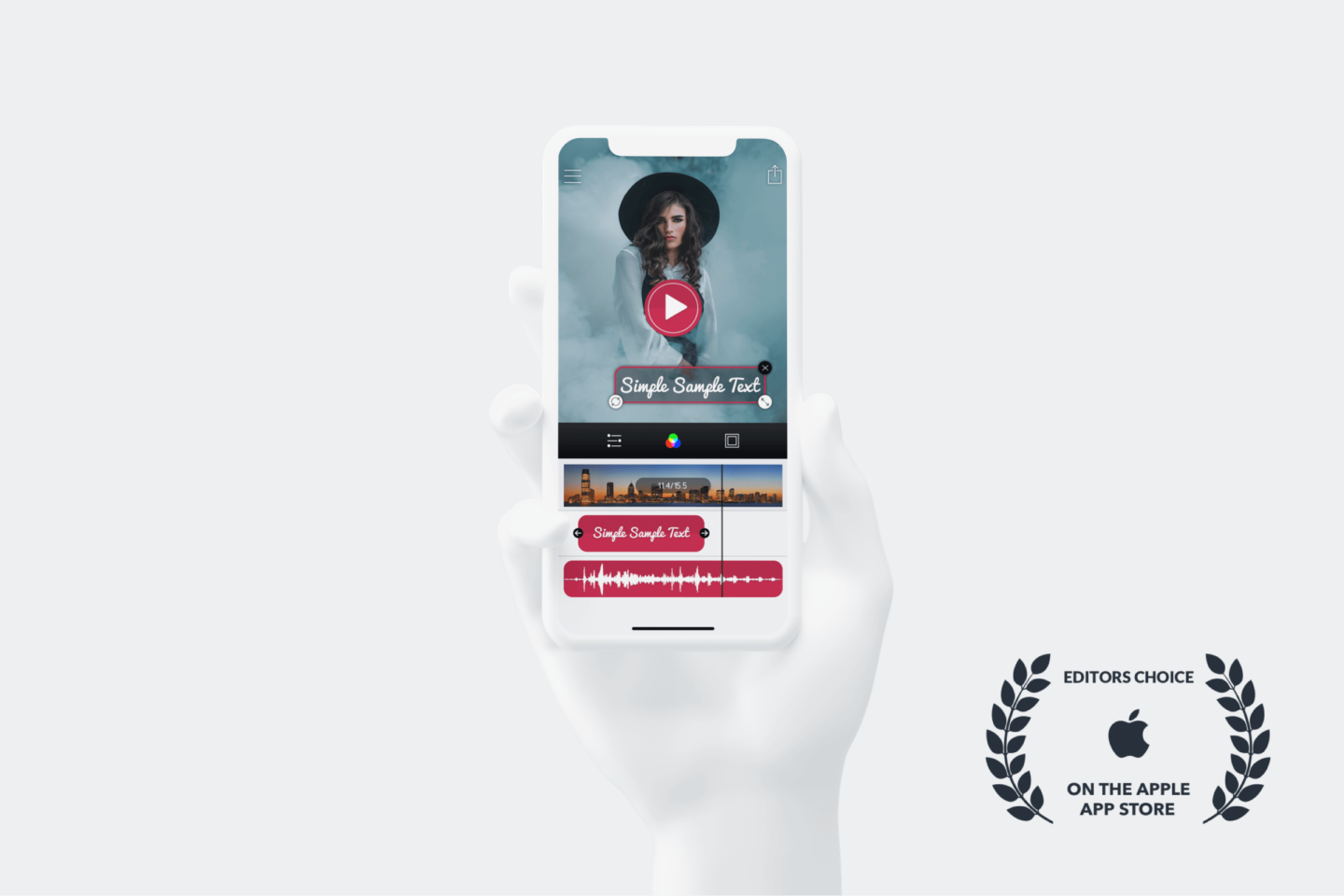
First, I worked on a product we eventually called Moments – an app that helps people create beautiful time-lapse and stop-motion movies in a matter of seconds. Users can add text, music, and filters to create professional touches to their videos.
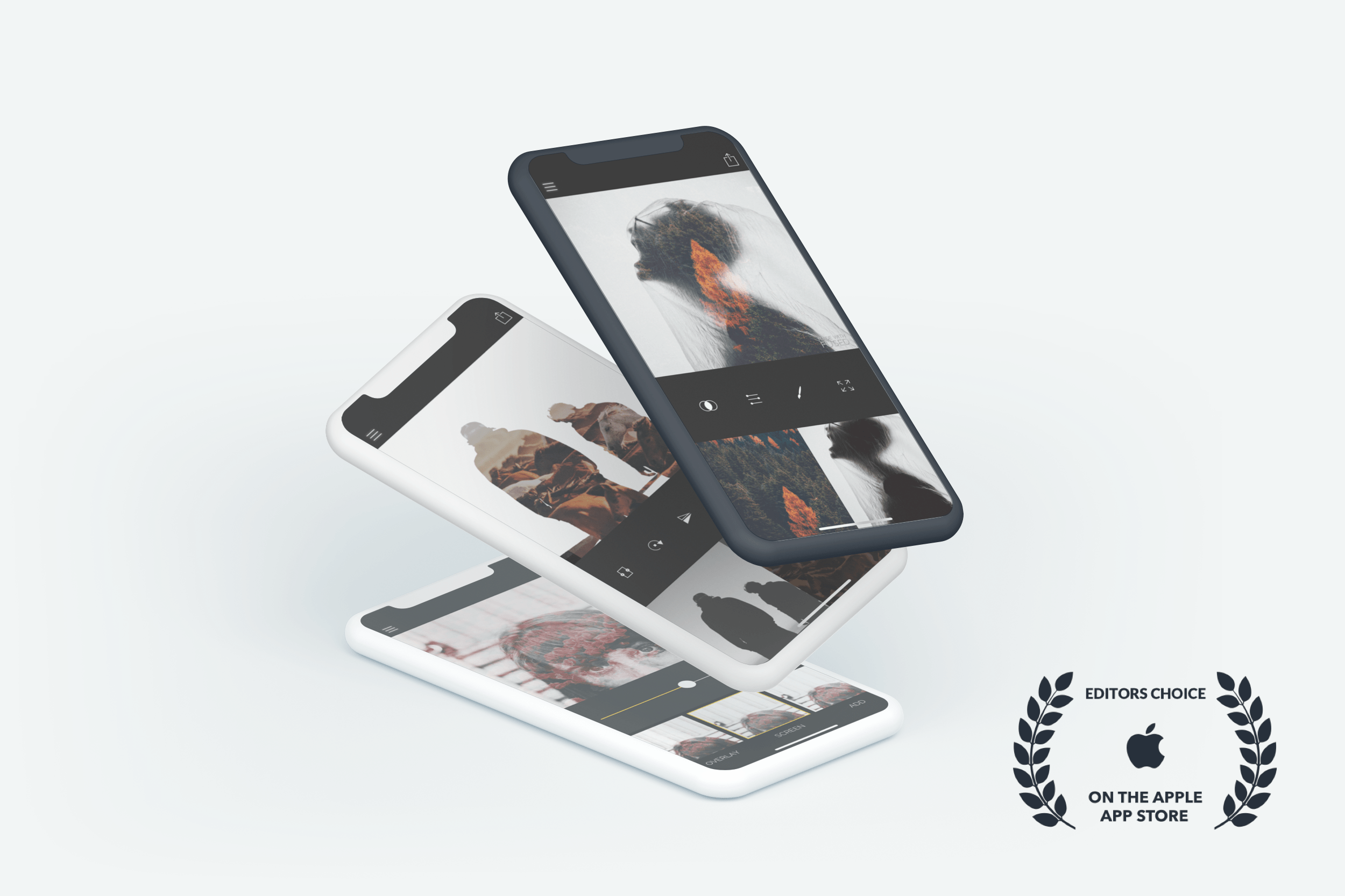
Lastly, I worked on Fused, which is an intuitive photo and video app that lets people blend videos, photos, or a combination of both. With Fused, they can easily create double exposure photos and unleash creativity by creating unique blends by adding filters to photos or videos.
Do you like what you see and have a project in mind? Let’s talk!
