The scope of work included User Experience, Interaction Design, and Interface Design.
What would you do if money were no object? I’m sure traveling the world would be somewhere on top of the list. But why do people love traveling so much? Before the agricultural revolution, humans were always moving around. There’s been quite a change of lifestyle since then, but the need to move around is still profoundly rooted in our biological apparatus.
By traveling, we get to learn about different cultures and gain new perspectives, which helps us to better understand the world around us. While travel can bring many benefits, not everything is pleasant.
The most annoying thing for me is getting from the airport to the accommodation of choice, not knowing what bus to take, or which side of the metro to stand. In places where there is no Uber, it’s even harder because I never know if the taxi driver is exploiting me by being a tourist.
Project and role overview
I remember one day looking at Angel List and seeing a product designer job posting from Welcome Pickups. Welcome Pickups strive to provide a relaxed, friendly, and personal travel experience. I fell in love with the product, and I decided to apply for a job which I eventually got.
My goal was to make the booking experience of our pickup service more delightful and frictionless as well as improve conversion rates.
The product has business to business as well as business to customer components. Welcome Pickups is first partnering with taxi and sightseeing companies (B2B), which then provide a service for travelers (B2C) through the platform.
Acquiring the right drivers
Our primary goal was to provide a friendly and straightforward travel experience for our users. That meant it was crucial for us to partner with the proper taxi drivers as they are an entry point of our service. For this reason, we handpicked every driver that applied through our online form. That ensured us to provide a high-end professional service.
The acquisition of the taxi drivers was also crucial because without fulfilling the traveler demand, we wouldn’t only limit the money coming in, we would eventually go out of business. We needed to have a good enough reason for the taxi drivers to partner up with us. That wasn’t that hard since our offer improved their day to day operations.
We sent them more customer traffic, so they wouldn’t have to wait at the airport for hours at end. All rides have been scheduled in advance, which helped them organize their time better. They were able to set their schedule. By using our driver’s mobile app, they have learned more about the traveler and their interests.
Why Welcome Pickups?
I hear you asking why would anybody book Welcome Pickups instead of a regular taxi? Well, let me explain. The main difference between a regular cab and a Welcome Pickups service is the experience a traveler is getting. They get 10x experience for the same price. One thing that we didn’t want to do is to charge a premium for the service, although it is a lot more enjoyable to ride with us.
All our Welcome drivers are exceptional English speakers. Travelers get information about who their Welcome driver is and their contact information. Upon pick up the Welcome driver will hand them a Welcome gift bag – something every traveler gets. It included a bottle of water to hydrate, a map of the city, and different points of interest.
When booking a Welcome Pickups service, travelers can also pre-order essential products such as sim cards, hotspots and skip the line tickets, and even full tours.
Increasing the conversion rate
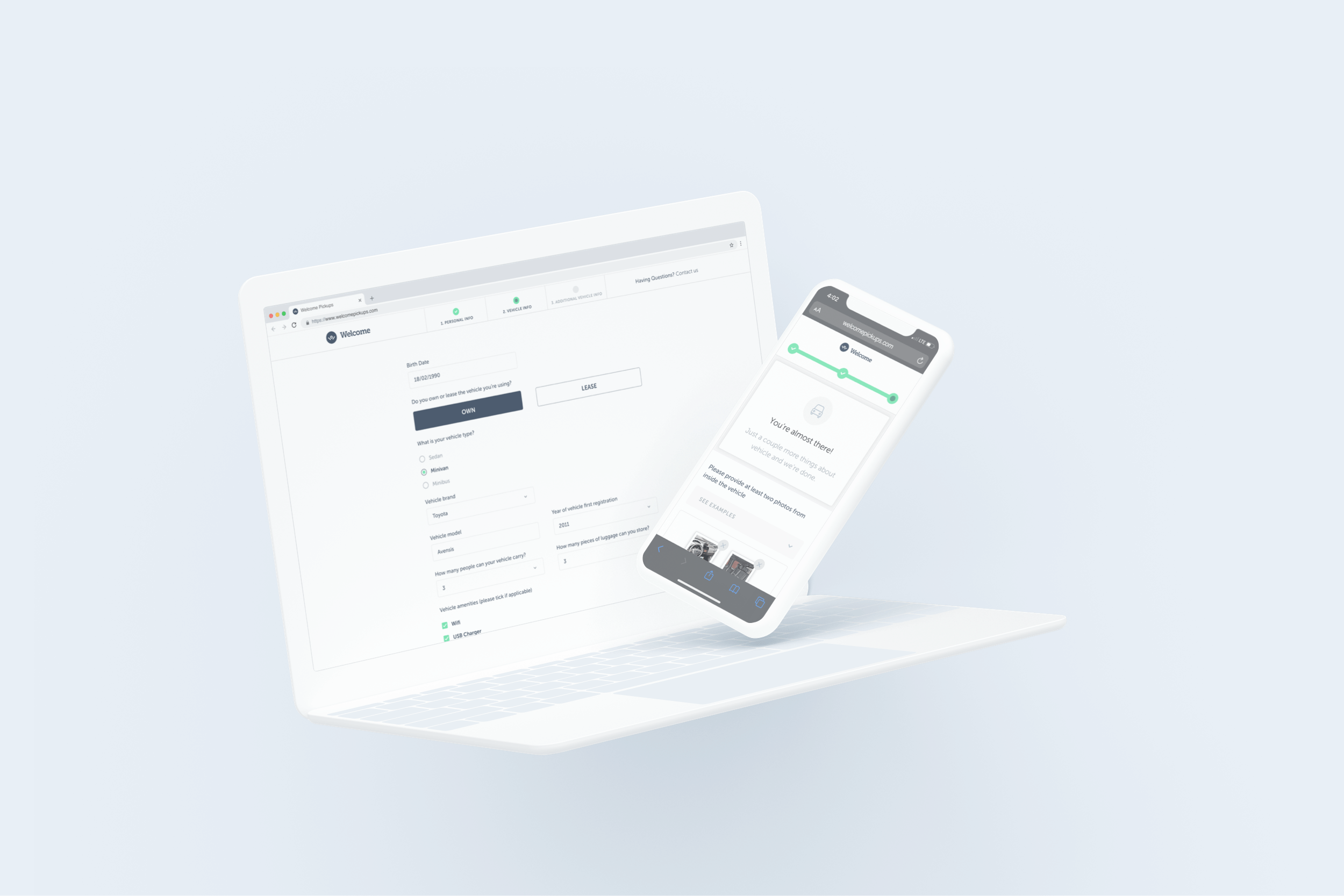
One of my first tasks at Welcome Pickups was to increase the conversion rate of our traveler signup flow. To do that, I first had to understand current user behavior, which would let me recognize frictions in the signup flow. Hotjar recordings were a huge help with this as I could see exactly how our users were using the platform and where they got stuck.
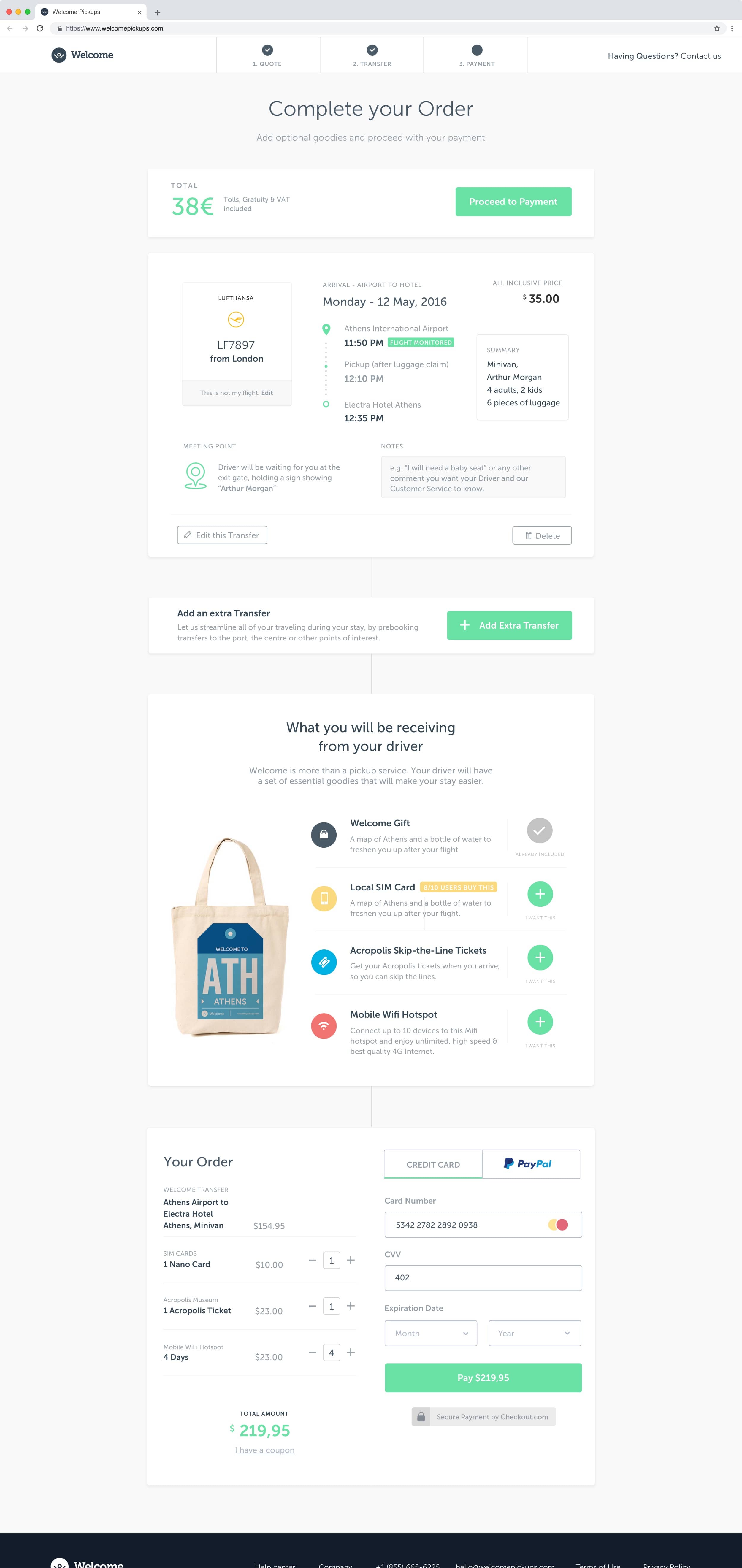
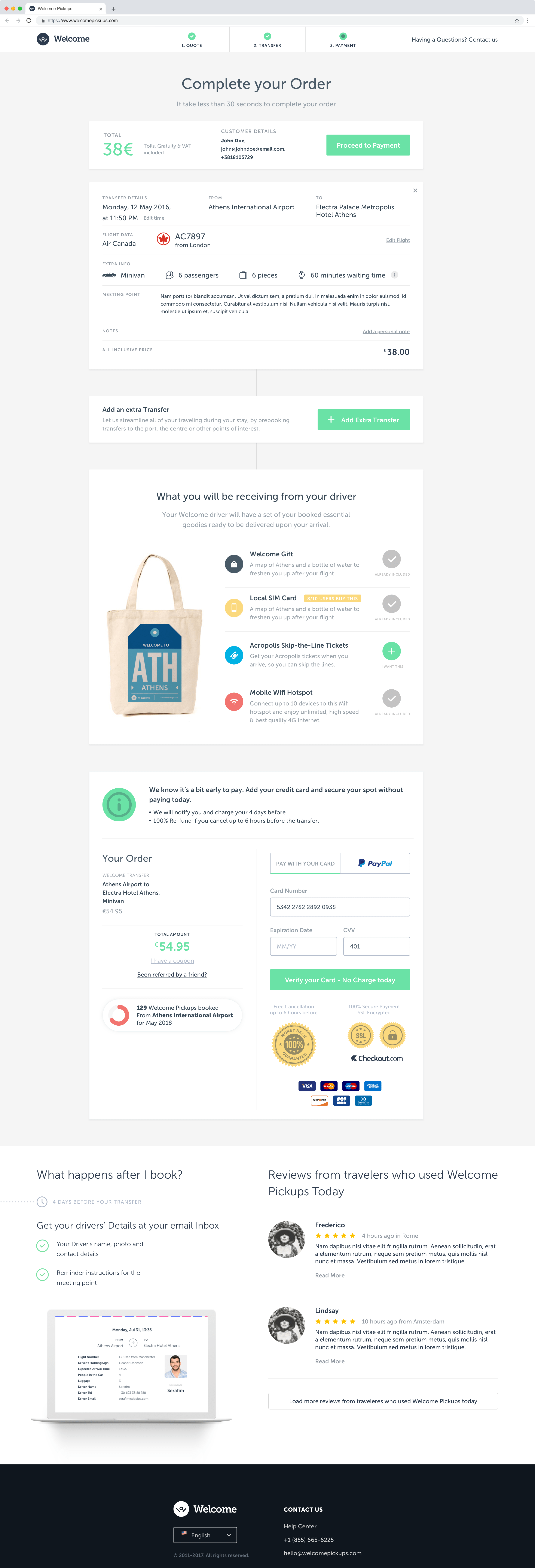
Our conversion page was performing quite well. It was the payment step where people were dropping off. After analyzing Hotjar recordings, I have identified that users were overwhelmed with the amount of information they had to review before paying for a service.
Because I couldn’t remove any information from that step, I’ve decided to re-think the layout in which we displayed information. Putting transfer details into horizontal rows made information easier to read. That also meant having a consistent way of editing these details.
A/B tests proved that the latter was converting better, but I knew there was some room for improvement. I’ve decided to have a conversation with some people that dropped off at this step. What I’ve learned was that they needed more reassurance. That led me to the conclusion that we need to let them know what the next steps are after booking as well as highlighting our secure payment and cancelation policy.
By reassuring them that we would only charge them four days before their trip as well as they can get a 100% refund if they cancel up to 6 hours before the transfer significantly improved our conversion rates.
Later we ran a different experiment with the same goal – to decrease the number of users dropping that abandoned the site before completing booking our service. We stripped down steps the user had to go through to complete the transfer, and combined three-step flow into a single inline form. We eventually discarded this idea when we found out that it’s performing worse than having multiple steps in a user journey.
Let’s get more users!
With the conversion page performing well, our next goal was increasing user acquisition. Most of our visitors were coming to the site from search engines. Typically they were searching for how they can get from an airport in a particular city, and we would appear somewhere on top of those results.
For us to rank higher, we knew we needed to come up with content that wasn’t purely functional but educational as well. Something people would share, even if they didn’t book our service. That led us to work on transportation guides for the cities our service was operating in.
After some months of search engine optimization, the guides pages and recommendation blog posts started to show results. We started ranking higher on Google, which drove more users to our platform.
Growing the business
With all the new users coming to the platform, we began thinking about other ways we could grow the business. By consumer segmentation and purchase situation analysis, we recognized an opportunity. We noticed that BnB bookings were increasing rapidly.
By learning more about that market and trying to see the world from their point of view, we’ve identified a couple of issues BnB hosts had. These were managing all their apartments as well as being on top of the traveler’s checking and checkouts.
With our infrastructure in place, we could optimize their workflow by automating their traveler check-in communication for them. Eventually, we built a dashboard from which we would automatically send each of their guest’s all transport options from the point of entry to their BnB.
We would then notify hosts of their guests’ arrival method. If their guests were arriving with Welcome Pickups, hosts were able to monitor their journey.
Results
For the time I was employed there, Welcome Pickups grew 300% year over year. In 2018 we serviced over 400,000 travelers in 32 destinations.
When I left, Welcome Pickups had an infrastructure in place to open two new destinations a month. Last year alone, they welcomed over 1 million travelers, expanded into 52 destinations, and partnered with over 1,000 hotels.
Do you like what you see and have a project in mind? Let’s talk!